CAPUCCINO
WHERE IS IT?
Carrer de la Cera 1, El Raval, Barcelona
WHAT IS IT?
Reform of a flat
WHEN?
2019 - 2020
HOW BIG IS IT?
Total: 49m2
We are in the middle of the Raval, very narrow streets, old buildings, apartments with very reduced spaces and very limited distributions.
Our client; a young and very cool girl, eager to have her first apartment adapted to her needs and designed according to her personality.
The first informations about the client we received before starting this project were simple:
She love Thailand, the city, she would choose salted passion fruit ice cream rather than chocolate, she said the less is more, and that she prefer going to the beach than going to the mountain, Yellow than gold, she likes to relax and lineal things.
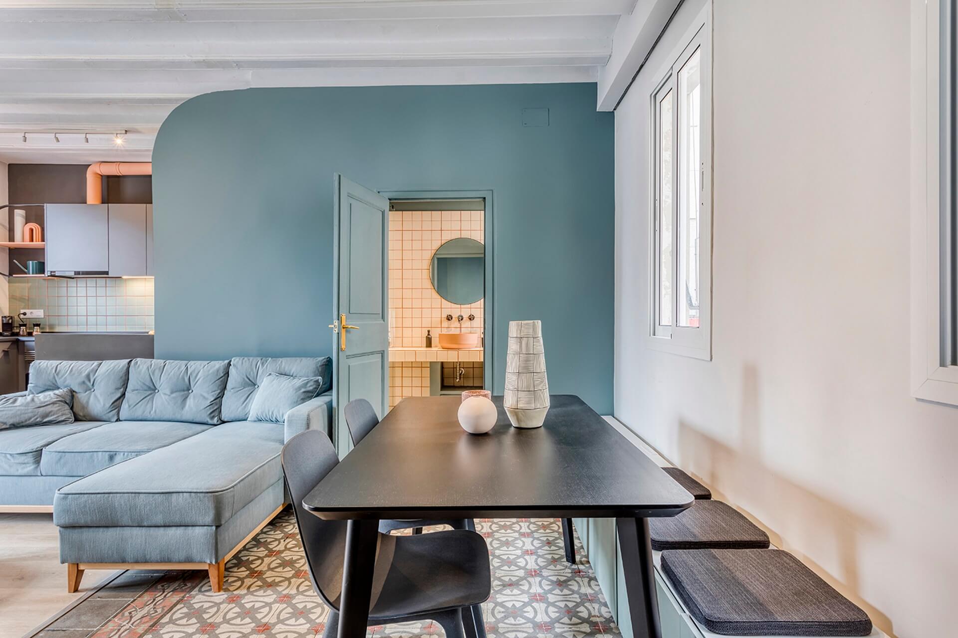
This old and typical Barcelona flat located in the Raval at the 3rd floor of an old building, was distributed with 3 small bedrooms, one kitchen, a living room that was just in the entrance, and one bathroom which you had to pass by one of the room to reach.
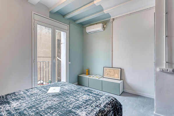
The first thing noticed by entering in the flat, was that the place was so closed by walls you couldn’t appreciate the natural light.
The client told us she loved to cook, she was going to share the flat with her boyfriend and that she really likes to receive people at home.
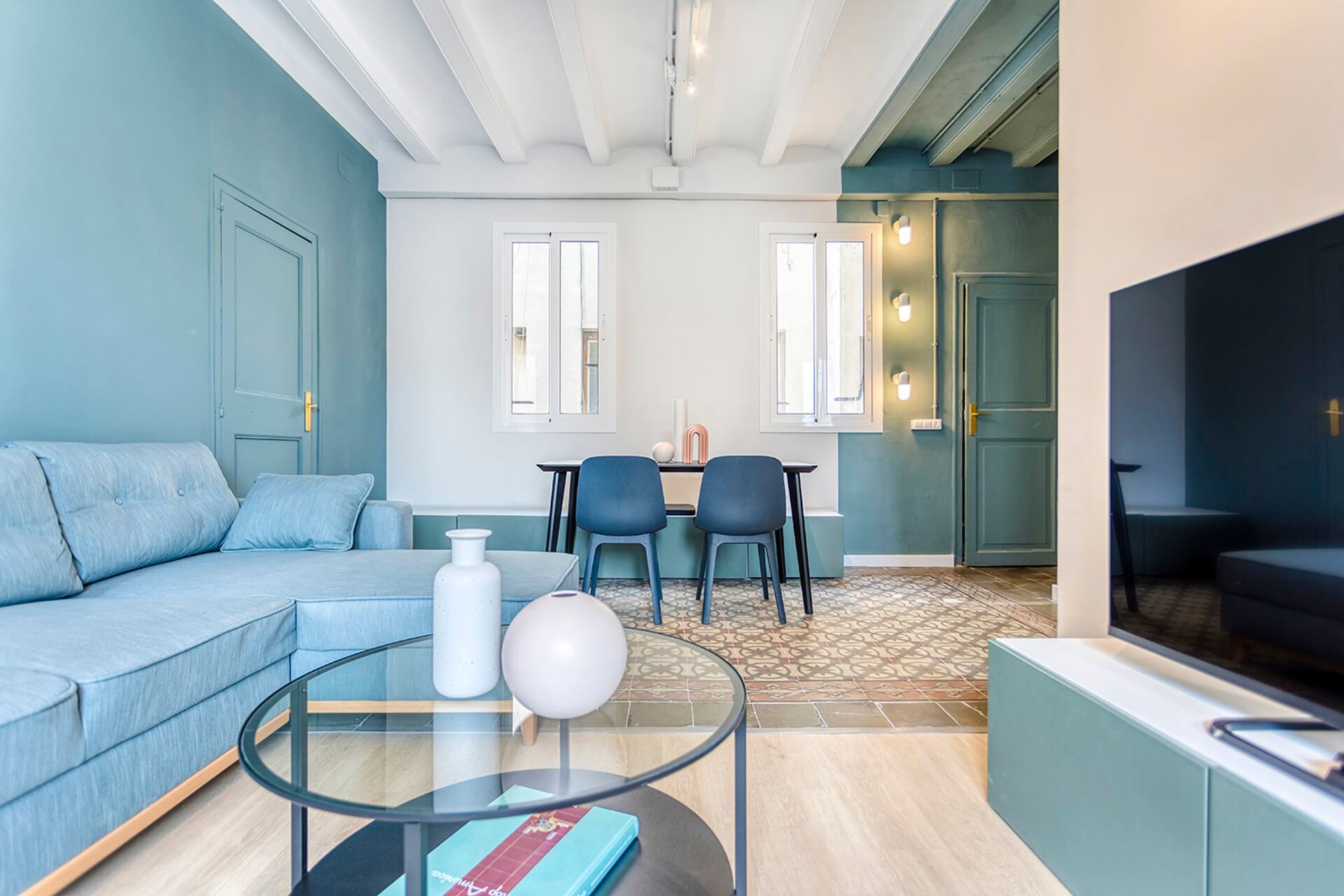
She fell in love with the flat because of the old ceramic typical floor of Spain, and wanted to conserve it. And of course, natural light was a must to her.
Michelle Lopez, co-founder, interior designer and architect:
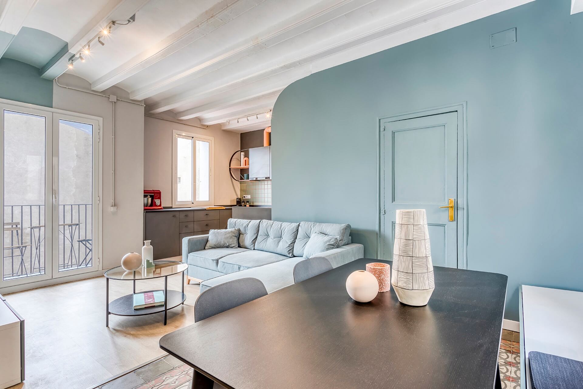
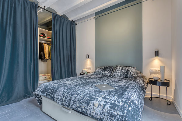
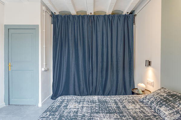
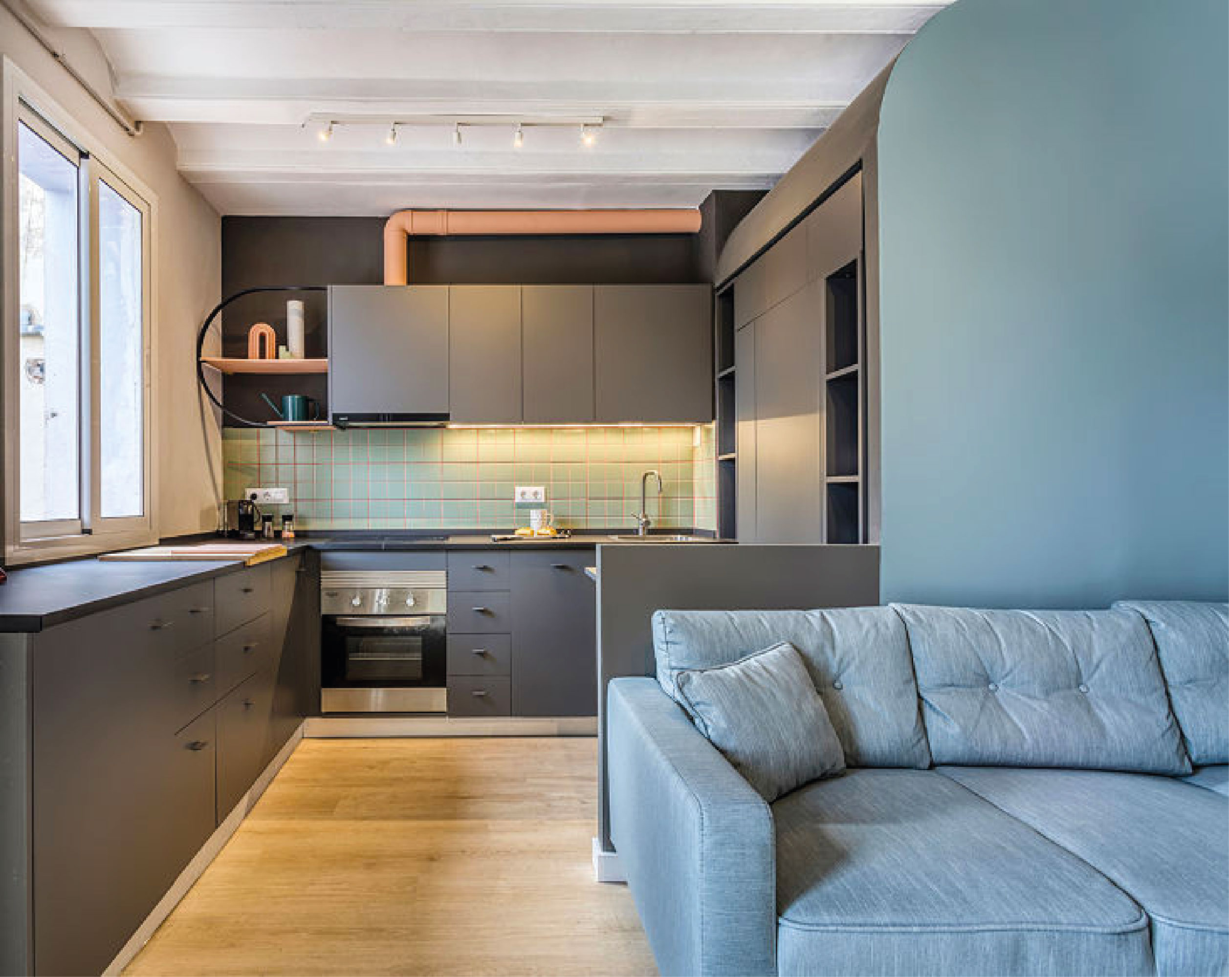
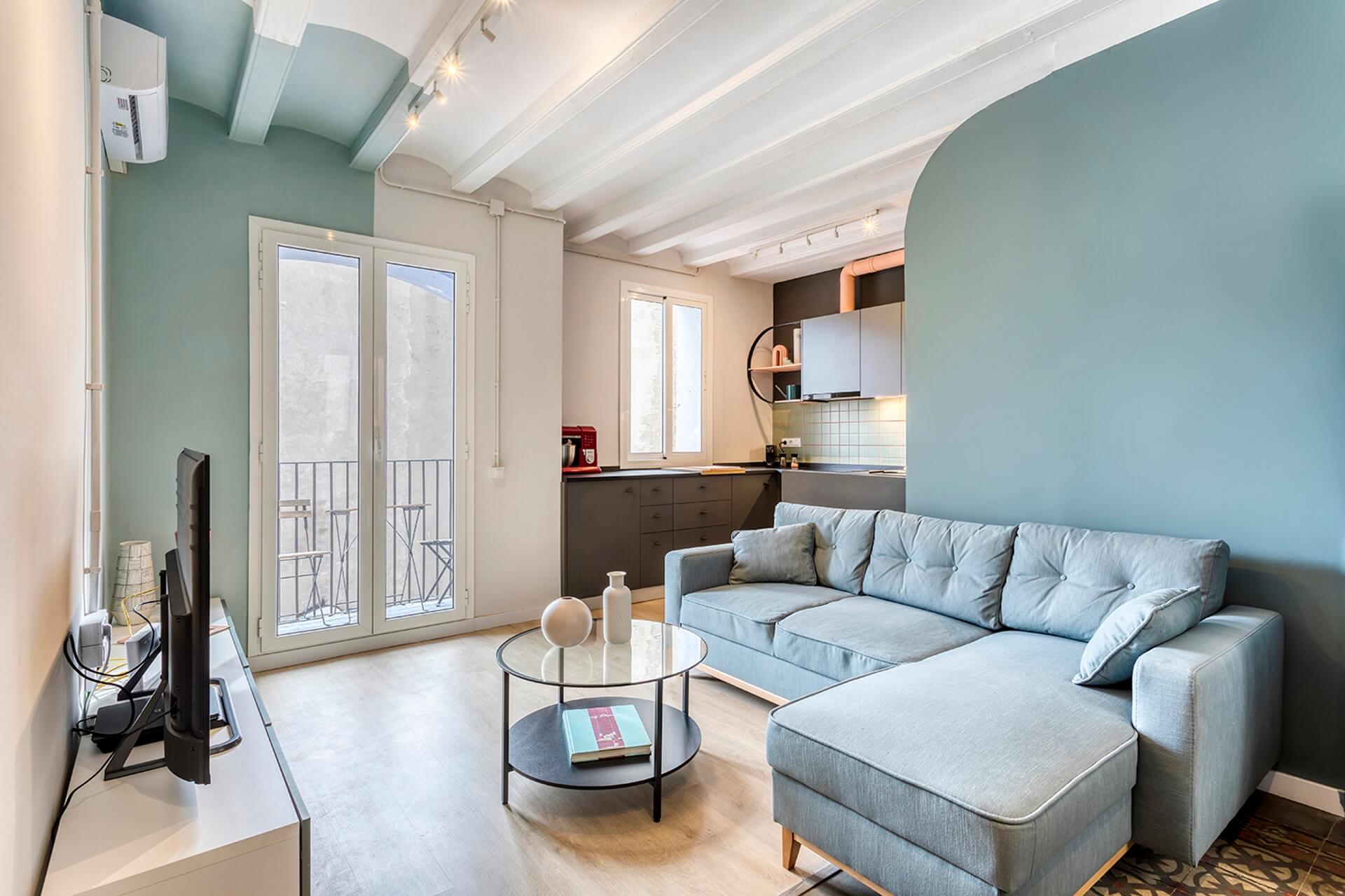
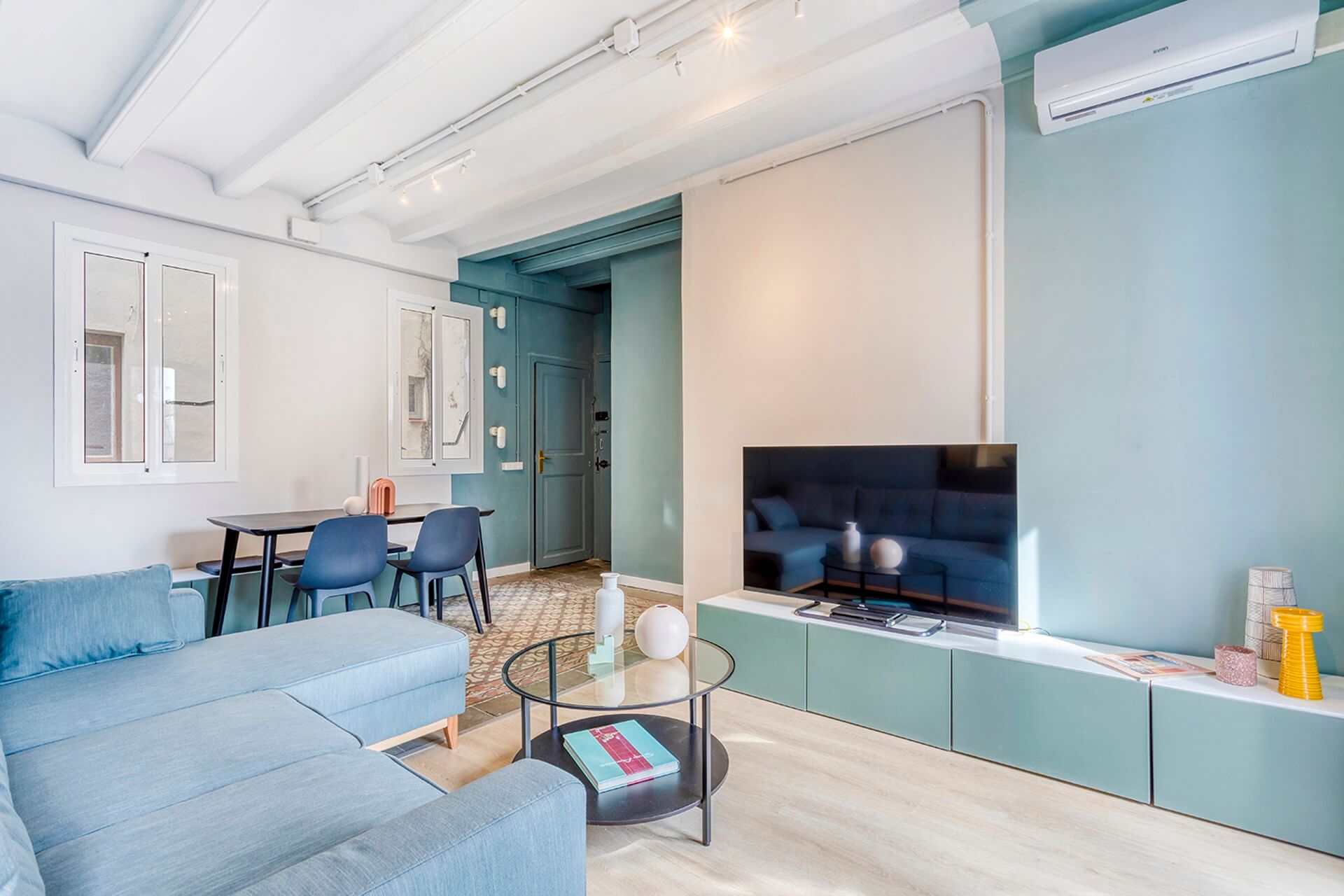
“In order to reflect and transmit everything the client was looking for and needs, we started with a basic concept where we tried to create amplitude and perspective within the whole space. On the one hand, the amplitude to generate open and unified spaces, and on the other hand, perspective to have a complete visualization of the space from any point of the project.”
Célia Antunez, Co-founder and Interior Designer:
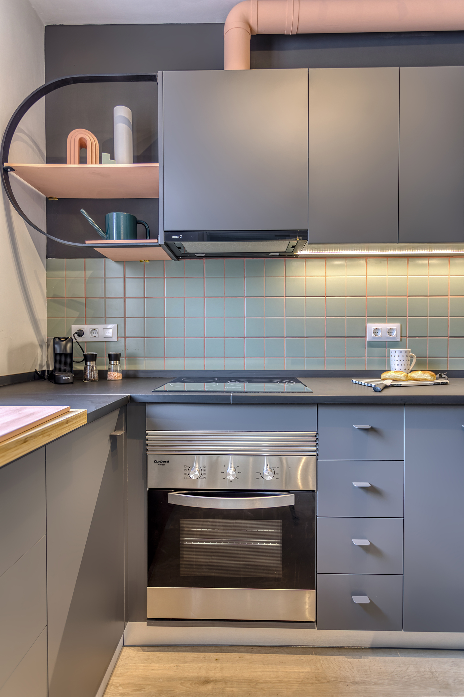
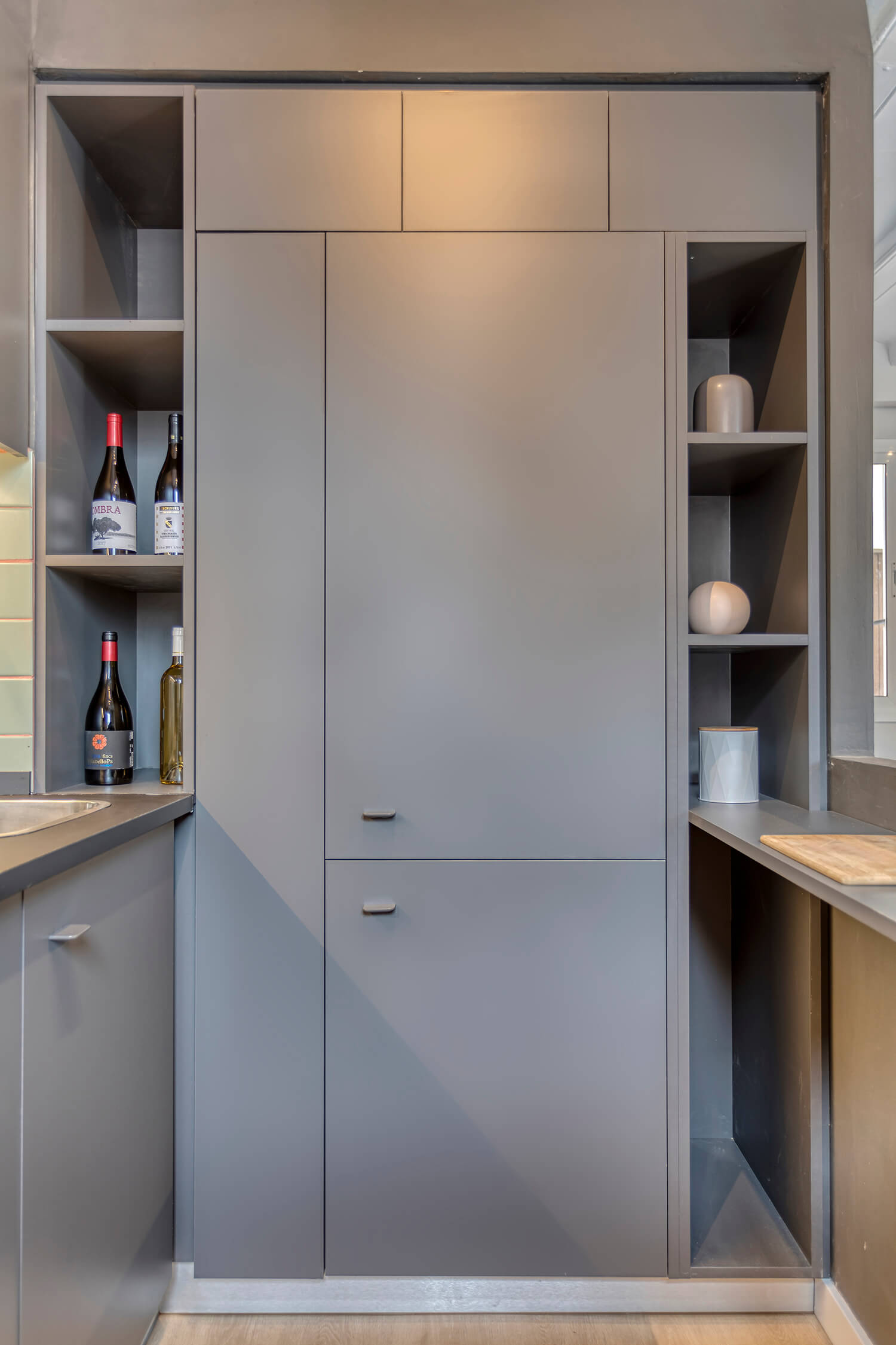
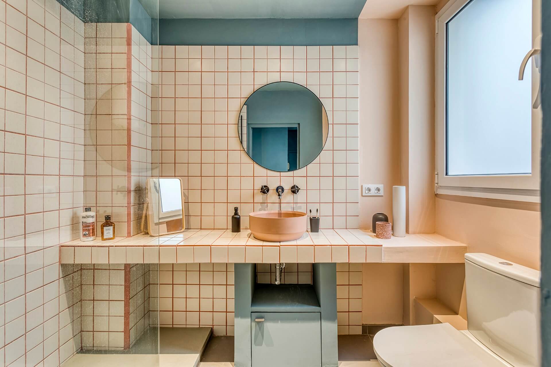
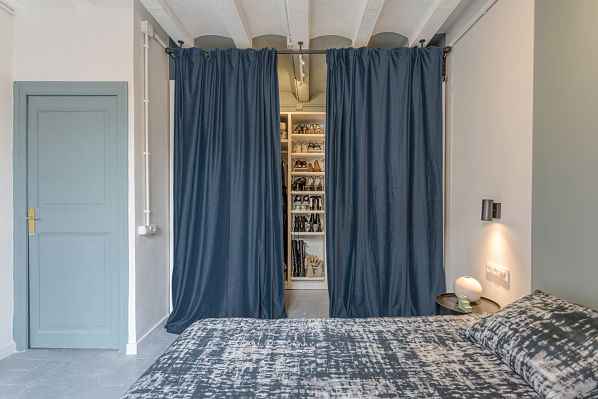
“Geometry and colors are some of the main characters of this project. Creating contrasts, playing with colors, incorporating geometry corresponding to each space in the place was very fun to design for this flat.”
Each space of this project has its own personality, fills up with insayn energy and reflects the youth in the space.
Enjoy your Capuccino!
BEFORE
AFTER
BEFORE
NORMALITY IS BORING,
WE DESIGN INSANELY
Estamos en medio del Raval, calles muy estrechas, edificios antiguos, apartamentos con espacios muy reducidos y distribuciones muy limitadas.
Nuestra clienta; una chica joven y muy guay, deseosa de tener su primer apartamento adaptado a sus necesidades y diseñado de acuerdo a su personalidad.
Las primeras informaciones sobre el cliente que recibimos antes de comenzar este proyecto fueron simples:
Ella ama Tailandia, la ciudad, ella elegiría helado de maracuyá salado en lugar de chocolate, dijo que lo menos es más, y que prefiere ir a la playa que ir a la montaña, Amarillo que el oro, le gusta relajarse y cosas lineales.
Este antiguo y típico piso barcelonés situado en el Raval en la 3ª planta de un antiguo edificio, se distribuía con 3 pequeños dormitorios, una cocina, un salón justo en la entrada, y un baño al que había que pasar por una habitación para llegar.
Lo primero que notó al entrar en el piso, fue que el lugar estaba tan cerrado por paredes que no se podía apreciar la luz natural.
La clienta nos dijo que le encantaba cocinar, que iba a compartir el piso con su novio y que realmente le gusta recibir gente en casa.
Se enamoró del piso por el antiguo suelo cerámico típico de España, y quiso conservarlo. Y por supuesto, la luz natural era una necesidad para ella.
Michelle Lopez, cofundadora, diseñadora de interiores y arquitecta:
"Con el fin de reflejar y transmitir todo lo que el cliente estaba buscando y necesidades, empezamos con un concepto básico donde tratamos de crear amplitud y perspectiva dentro de todo el espacio. Por un lado, la amplitud para generar espacios abiertos y unificados, y por otro lado, la perspectiva para tener una visualización completa del espacio desde cualquier punto del proyecto."
Célia Antunez, cofundadora y diseñadora de interiores:
"La geometría y los colores son algunos de los protagonistas de este proyecto. Crear contrastes, jugar con los colores, incorporar geometría correspondiente a cada espacio del lugar fue muy divertido de diseñar para este piso."
Cada espacio de este proyecto tiene su propia personalidad, se llena de energía Insayn y refleja la juventud en el espacio.
¡Disfruta de tu Capuccino!
LA NORMALIDAD ES ABURRIDA,
DISEÑAMOS LOCAMENTE