ALCAMPO
Supermarket
October 18’ to February ’19
Total: 1052m2
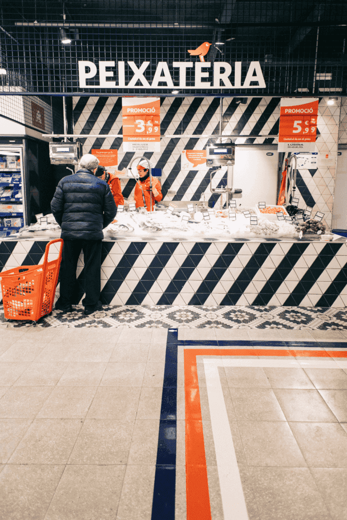
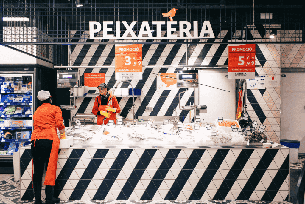
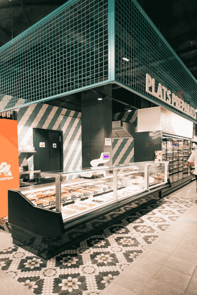
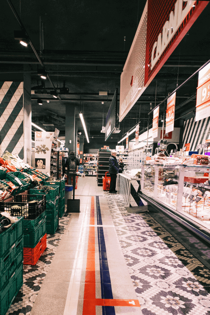
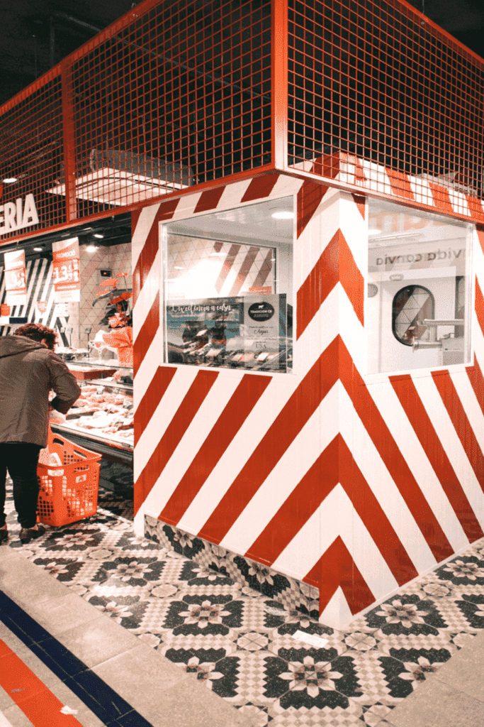
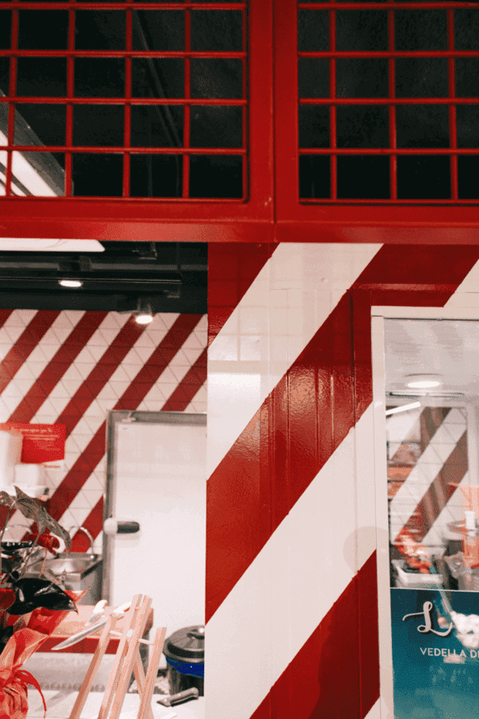
The interior design of this supermarket was created with the collaboration of Pelusa Studio, the Alcampo team and other industrialists.
This project is located in the Gotico, Old city of Barcelona.
Michelle Lopez, co-founder, interior designer and architect:
"Why do the supermarkets have to be white, boring and with everything but design?”
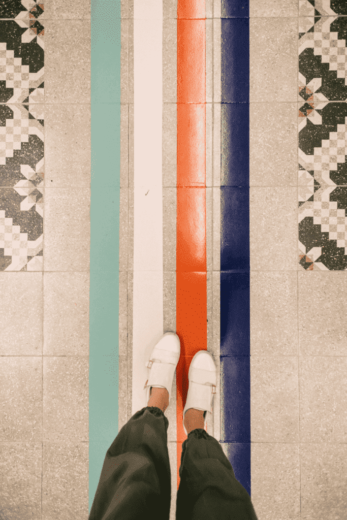
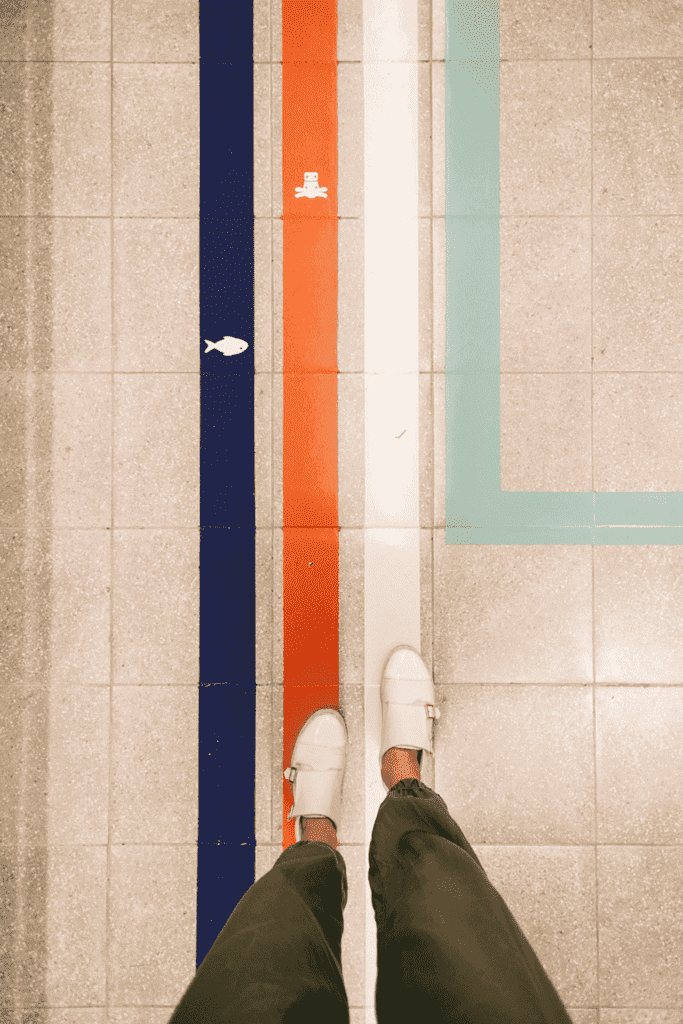
We all go several times a week to the supermarket, it's part of everyone's daily life. For this reason, these kinds of places should bring us happiness, and colors are the key! This project make a turn into how supermarkets should be designed.
Célia Antunez, Co-founder and Interior Designer:
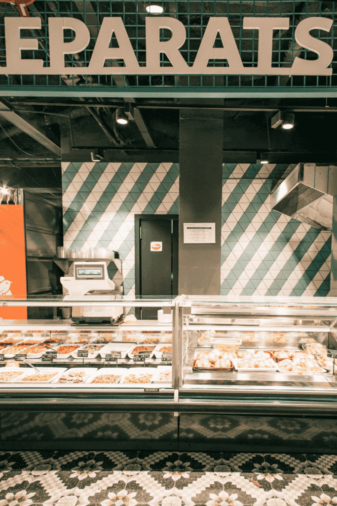
"Incorporating colors into each stand and on the floors, helps people to know exactly where to find what they need, and make them avoid running for 20 minutes all over the place before finding this poor jar of mustard.”
The ceilings are black in order to help your eyes not get attacked when you look at all those products on the illuminated screens, and it also adds value to the products.
What do you think of this new INSAYN way of designing supermarkets? Now we know that shopping will be a lot more fun and we'll enjoy doing it.

